Coaching with Sarah J
High-Ticket Mentorship Funnel for a Business Coach
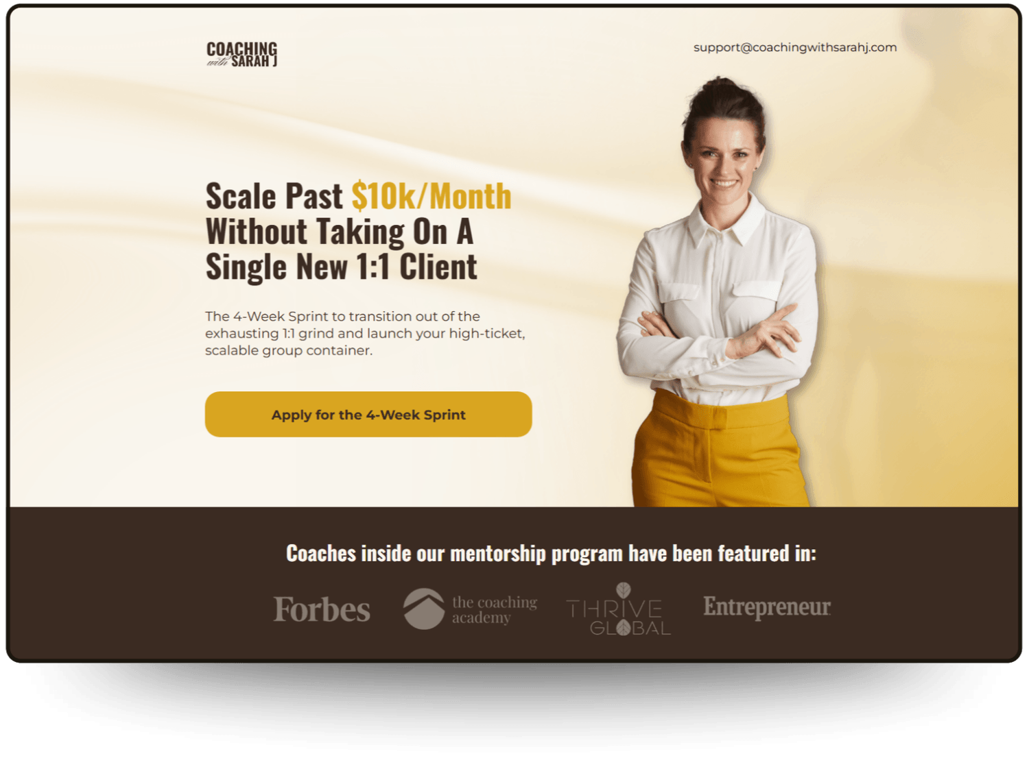
The Client: Sarah J, a Business Mentor helping booked-out service providers scale past $10k/month without taking on more 1:1 clients.
The Goal: Sarah was offering a premium mentorship, but her previous page was confusing. It asked visitors to grab free maps, secure audits, and apply for mentorships all at once, leading to decision fatigue.
The Mission: To create a zero-friction journey. A funnel that builds undeniable trust and guides high-level coaches naturally toward her application without feeling like a pushy sales pitch.
Coaching with Sarah J
High-Ticket Mentorship Funnel for a Business Coach
The Client: Sarah J, a Business Mentor helping booked-out service providers scale past $10k/month without taking on more 1:1 clients.
The Goal: Sarah was offering a premium mentorship, but her previous page was confusing. It asked visitors to grab free maps, secure audits, and apply for mentorships all at once, leading to decision fatigue.
The Mission: To create a zero-friction journey. A funnel that builds undeniable trust and guides high-level coaches naturally toward her application without feeling like a pushy sales pitch.
The "Why" Behind the Design
The Trap
The standard coaching funnel bombards visitors with conflicting options and vague messaging. For a high-ticket audience looking for a clear path to scale, a confused, cluttered layout immediately causes friction, triggers decision fatigue, and costs you premium leads.
The Pivot
We flipped the script from "Decision Fatigue" to "Seamless Conversion." Instead of a traditional, noisy sales page, we stripped away the fluff and focused the entire page on ONE clear action. The design does the heavy lifting to establish authority before they even read a word.
The Solution
("The 2x2 Grid Layout")
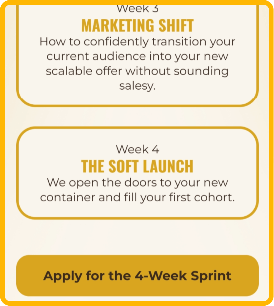
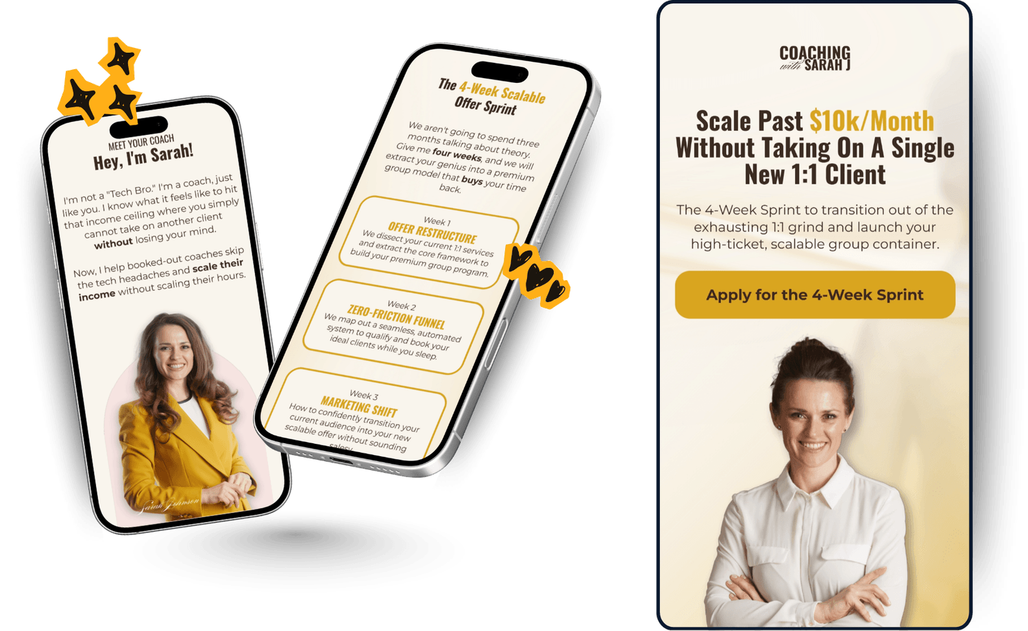
The 2x2 Grid Layout
Instead of a never-ending scroll of curriculum, we used a clean 2x2 grid to break down her 4-Week Sprint. It makes the high-ticket investment feel actionable and scannable, not overwhelming.
Premium Authority Palette
We used a grounded palette of Deep Espresso and Golden Mustard to establish immediate credibility, balanced with breathable Ivory and warm Dusty Rose to maintain human connection.
Strategic Social Proof
We integrated a dedicated Authority Bar and lifestyle-driven testimonials to validate the investment and build undeniable trust for a premium offer.
Leading with Empathy
Visual Empathy. Instead of using a heavy, oppressive dark block for the reality check, we used a warm, muted rose gradient. It validates the exhaustion of a capped schedule with empathy rather than pressure, lowering the visitor's guard.
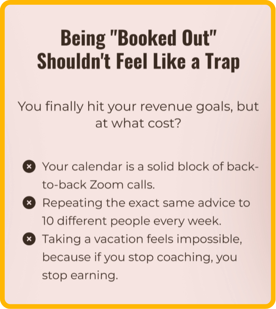
Leading with Empathy
Visual Empathy. Instead of using a heavy, oppressive dark block for the reality check, we used a warm, muted rose gradient. It validates the exhaustion of a capped schedule with empathy rather than pressure, lowering the visitor's guard.
The Relief Transition
Visual Relief. Transitioning from the empathetic reality check into a breathable Ivory background literally feels like a breath of fresh air, subconsciously signaling that this sprint is the clear, achievable solution.
The Relief Transition
Visual Relief. Transitioning from the empathetic reality check into a breathable Ivory background literally feels like a breath of fresh air, subconsciously signaling that this sprint is the clear, achievable solution.
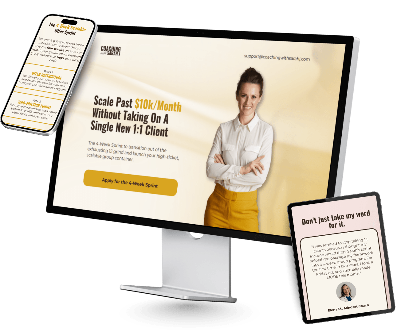
The full high-fidelity build, implemented in Systeme.io.
The full high-fidelity build, implemented in Systeme.io.
The full high-fidelity build, implemented in Systeme.io.


The full high-fidelity build, implemented in Systeme.io.
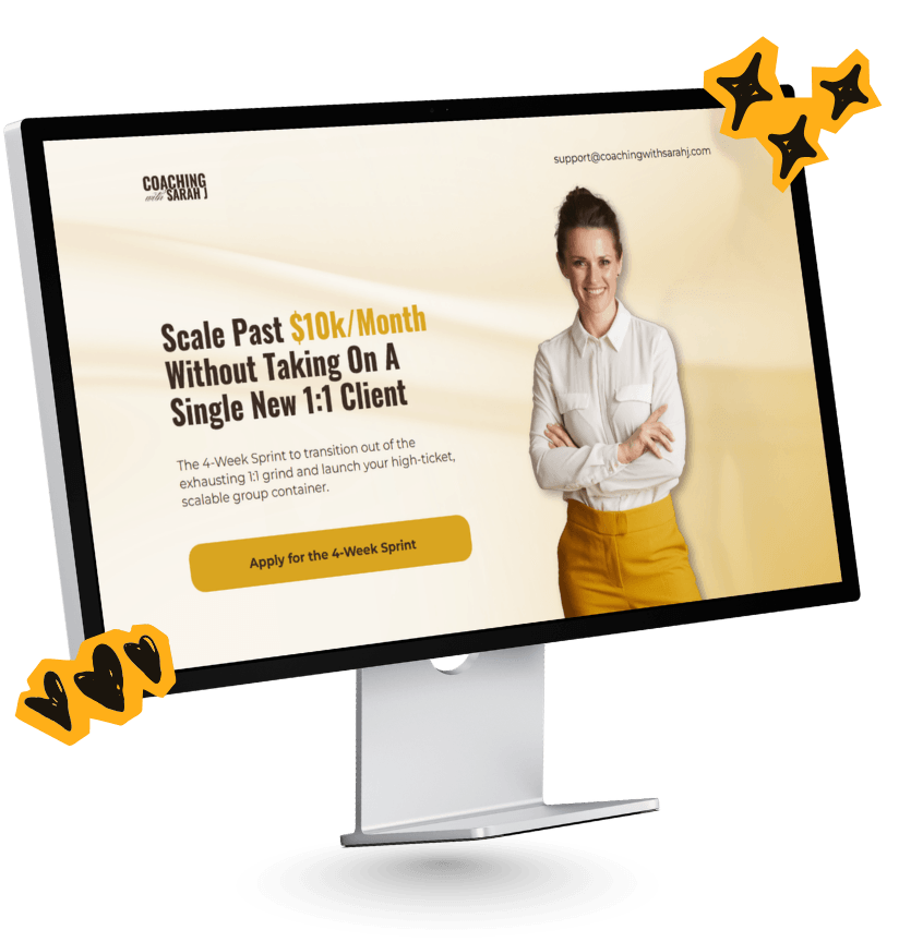
Authority at First Sight.
The streamlined messaging and premium aesthetic completely removed decision fatigue. By aligning the container with the exact needs of her high-ticket audience, the funnel now operates quietly in the background and automatically qualifying leads and filling her calendar with coaches who are truly ready to scale.


© 2026 Funnel Blueprint by Tine. All Rights Reserved. System Status: Online 🟢